
Font : Courier New
Font Size : 12
Margin : 1 inch all around
Line Spacing: Double
That is all basically correct, but there is a snag - It's impossible. Get over it, stop the hand wringing, it's impossible.
The reason is this: A standard typewriter uses 12-point type, which is a measure of the height of the metal block on which each individual letter is cast. This also equals the height of a each line of printed type the typewriter produces, meaning that a typewritten line is 12 points high, or 1 pica, or 1/6 of an inch. Single-spaced, this means you can fit six lines of type per inch. Double-spaced, you get three lines per inch. Working from this basis, we see that the essential definition of a 12-point font is one that prints in a line exactly 1 pica high. You would think that a word processor would follow that definition and default to a line height of exactly 1/6 of an inch for a 12-point font, but MS Word and other popular word processors doesn't. For whatever reason, its default line height is slightly more than that—about 0.185" as opposed to the expected 0.167".
Attempting these setting will give you the following on these word processors:
Microsoft Word: 24 lines
Mac OSX Pages : 23 lines
LibreOffice : 24 lines
I find it amusing that these three big market leaders all get it wrong.
So we have to fudge it, you have three parameters to change (a) Font Size (b) Margins (c) Line Spacing. So what to do? Here is my opinion on each:
Font Size - Don't fudge this.
If you go down to 11 point, it is going to look noticeably smaller, the publisher's eyes will immediately know something is wrong, and you are going to end up with too many lines. In Microsoft Word for example, you will get 26 lines of text and an extra wide margin at the bottom because there is almost room for 27 lines. If you attempt to use decimalized font sizes, like 11.8 point, this may cause kerning issues depending on the math of the font, and if your manuscript is uploaded directly into type-setting technologies, this will cause confusion and extra work.
Margins - Don't fudge this.
Dropping the margin size a tiny bit might be OK, you would have to drop the top and bottom to 0.8" but that might be noticeable, and its going to look asymmetrical unless you reduce the left and right margins as well - trouble is that is going to lower the average numbers per line and therefore per page. Remember, all these rules have two central purposes. (1) Make the manuscript easy to read (2) make it easy for the publisher to gauge the length of the book.
Line Spacing - fudge away!
The line spacing rule is to allow the manuscript to pop off the page easily and to allow space for the publisher to make notes. Use the following:
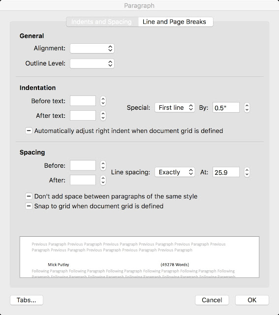
Microsoft Word: Exactly 25.9 pt
Mac OSX Pages : Exactly 25.9 pt
LibreOffice : Fixed 0.36"
How much of a deviation is this? Using Microsoft Word as an example, If you change the line spacing from 'Double' to 'Exactly 25.9 Point' the line spacing is reduced by 0.5 mm or approx. 1/50th of an inch. This will not be noticed and will not cause any issues. The other reason I like this option is that it directly addresses the original issue of the line height being set wrongly by Microsoft et al. Below if a screen shot (from Word)
Cheers!
Part Two... The rest of the formatting.
So the above was a technical article since this is a technical blog, however I might as well include the rest of the current 'standard'. Here is a recap and the rest of the details:
Always check a publisher's submission standards, they may overide and overrule the following
- Font
- Courier New
- Font Size
- 12 point
- Margin
- 1" all around
- Align
- Left, not justified
- Line Spacing
- 25.9 Point (depending on word processor, see above)
- Indent
- 0.5" for first line of each paragraph.
- With the correct font and font size, most word processors (including Microsoft Word) have 0.5" configured for the tab key.
- Better still use the paragraph formatter (see screen shot).
- Things not to do
- Do not put a blank line between paragraphs.
- Do not use double spaces between sentences.
- Do not add any silly copyright messages, do not question the integrity of the publisher, you will just make them angry.
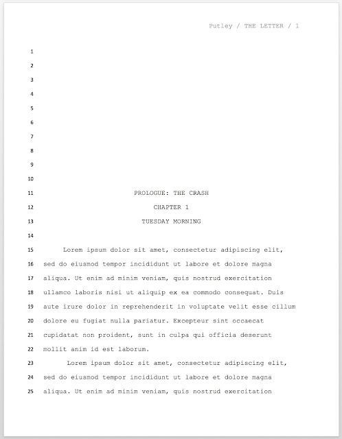
- Page Numbering
- (see header information)
- Scene Breaks
- Use a single centered hash #
- Be careful not to allow your word processor to place the # 05" left of center because of the paragraph formatter, you will have to manually set that single line paragraph to 0"
- Chapter Breaks
- Start each new chapter on a fresh page.
- The word 'CHAPTER' and the chapter number should be on the 12th line of the page.
- The name of the chapter should be on the 13th line of the page.
- There should be one blank line (without a #) on the 14th line of the page
- On the 15th line of the page, recommence the text
- The chapter number should be numeric.
- If your story is broken into parts/volumes/sections as well as chapters, and this is a part/volume/section break as well, the name of the part/volume/section should be on the 11th line.
- Everything on lines 13, 12, and (if used) 11 should be upper-case and centered (again, be careful not to allow your word processor to place the # 0.5" left of center because of the paragraph formatter, you will have to manually set that single line paragraph to 0")
- End
- At the end of the manuscript, skip one line and then type "THE END" in upper case, centered, usual warning about not indenting 0.5"
- Header
- The header should be vertically centered inside the top 1" margin.
- The header should simply be your last name / Book Title / Page number
- The name, title should be upper-case and the page number numeric
- The header should be right justified
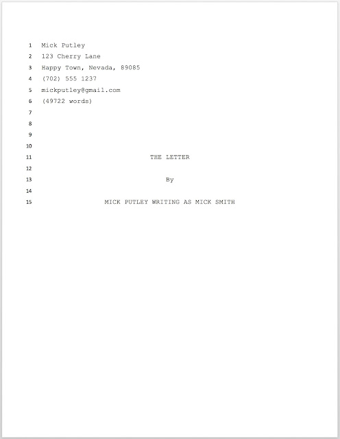
- Title Page
- The Title page should not be have the header or be numbered in anyway.
- Contacts section
- Line #1 - Your real/legal name.
- Line #2 - Street address
- Line #3 - City, State, Zip
- Line #4 - Phone number
- Line #5 - Email address
- Line #6 - "Approximately XXXXX words"
- Insert the word count, use the count from your word processor, not a calculated average.
- Everything in the contacts section should be left justified, 1.5 line spaced and in mixed case.
- Title Section
- Line #11 - Manuscript title
- Line #12 - Blank
- Line #13 - "by"
- Line #14 - Blank
- Line #15 - Your name. If you want to be published under a pen-name, write your name "writing as" then your pen-name.
- Everything in the title section should be upper-case and centered (usual warning about the 0.5" indent.
Finally here is a basic example, note the line numbers are shown for guidance, they should not be on your final manuscript.
Hope this helps, good luck, cheers!
No comments:
Post a Comment